Your Color Mixing Guide.
Some Recipes To Get You Cooking With Paint.
Use our practical color mixing guide to create your own set of go-to default paint recipes.

One of the most challenging aspects of making paintings is mixing color. This is where a color mixing guide becomes invaluable. There are so many hues and nuances that creating colors for your paintings can be completely overwhelming.
Developing a strategy to get past this is a pretty useful thing to do. We have all been stopped somewhere in a masterpiece (sometimes completely. Bin.)
A great process to get past this is to throw paint at the canvas without taking too much time to work out all the colors. The beauty of this is twofold:
- The pressure is taken off. You can leap around and play with your paint. No worries, you know you can paint over it.
- The mess you HAVE made is a lot closer to a finished painting than a blank canvas. I'm being a bit cheeky here but, this is actually quite profound (trust me, I'm an artist.)
This roughing in process is a way for you to "measure" your painting’s colors (and shapes). You can stand back and see what alterations you need to make to get where you need to be.
For example, the sky is nice but needs more Pthalo Blue. The water is horrible, make it greener/yellower etc.
The best thing about this concept is that it will start the process of you developing your own color mixing guide (if you haven’t already). Eventually you will have a set of "go-to” colours for everything. This will help you get paint down fast AND get you reasonably close to the colors you eventually want.
How is that going to help you now? Don’t panic, we here at Explore HQ have already done this. We have created a series of "default settings" or paint recipes for all (almost) occasions. These may get you through until you develop your own color mixing guide.
Our disclaimer. A color mixing guide is not going to solve every color mixing problem. They will get you close. Your responsibility is to make any subtle changes that are necessary.
Here are a selection of my color mixing guides or paint recipes that are very useful, and use Atelier Interactive Artists Acrylics by Chroma. I use Artists quality acrylic paints by Chroma Australia, Atelier Interactive and also use Atelier Free Flow.
Color Mixing Guide -
Clear Warm Summer Sky
Colors:
- Titanium White
- French Ultramarine Blue (warm blue)
- Pthalo Blue (cool blue)
Starting at the horizon, mix White and French Ultramarine Blue in a pale mix. As you come up the sky add more French Ultramarine Blue, then as you get higher still add more French Ultramarine Blue with a touch of Pthalo Blue.
Viola, clear summer sky. Alternatively, you may want to dirty the sky low to the horizon. A touch of Cadmium Yellow Medium is handy.
Get the idea? Set up your basic paint recipe for an element and then make tiny (or large) adjustments.
Record your own for future reference.
Color Mixing Guide -
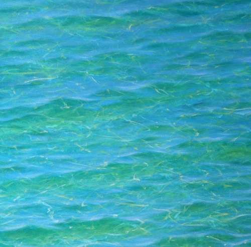
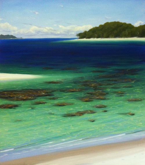
Clear Cool Tropical Water
Colors:
- Pthalo Blue (cool blue)
- Cadmium Yellow Light (cool yellow)
- French Ultramarine Blue (warm blue)
- Titanium White
Start with a mix of Pthalo Blue, Cadmium Yellow Light and a small amount of White at the top of the canvas.
Add more Cadmium Yellow Light and White as you come down the canvas (shallow water) in a smooth gradation.
Create refraction in the water using the same colours.
Then add a mix of French Ultramarine Blue and Titanium White in a sky colour and add some sky reflection.
(A tutorial for this one is coming soon on our Youtube channel. In the meantime, if you're interested in learning to paint gorgeous tropical water in more detail, have a look at our downloadable V-Logs.)
Here’s the PDF version for you though, found in Acrylics Anonymous Issue 013.
And again, if you need to make changes, you’re sorted. Use these as a basis and add hints of other colors.
Click here for Mark’s wave recipe.
Color Mixing Guide -
Wet Sand
Colors:
- Titanium White
- Cadmium Yellow Medium (warm yellow)
- Dioxazine Purple
The sand closer to the water is wet, so it appears darker.
Mix a pile of White with touch of Dioxazine Purple and a touch of Cadmium Yellow Medium.
As the sand becomes drier, add more White. Easy.
In tropical areas with almost pure white sand, use more Titanium White, and in areas where there is a lot of coarser sandstone-y kinda sand, use less White.
Click here for an excellent beachscape broken down into even more recipes for you!
Color Mixing Guide -
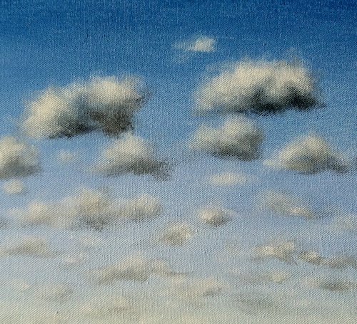
Fluffy Summer Clouds
Colors:
- Titanium White
- French Ultramarine Blue (warm blue)
- Burnt Umber
Mix a pile of White with a touch of Burnt Umber and French Ultramarine Blue.
This is the shaded bit on the underside of your cloud. Add white, and build up the next level of shadow. Keep adding white as you get to the highlights. Click here for more cloud paint recipes, or to check out the Acrylics Anonymous this came from, click here.
Color Mixing Guide -
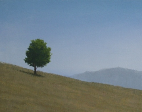
Trees & Foliage
This is a great one as it has many applications.
Colors:
- Forest Green
- Dioxazine Purple
- Cadmium Yellow Medium (warm yellow)
Mix Forest Green with a touch of Dioxazine Purple and Cadmium Yellow Medium. This creates your shadows.
Adding the green and the yellow to the mix will give you some highlights. Keep adding yellow to give you even more highlights.
Remember, this is a rough color mixing guide only. You may need to add White here to get paler highlights or a cooler yellow like Cadmium Yellow Light to give brighter highlights.
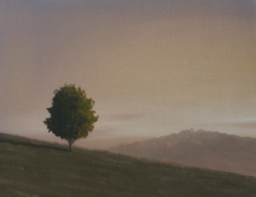
With this one you can also "cool down” your trees by using less Dioxazine Purple and more Forest Green, or warm them by doing the opposite. Same colors, different amounts, different times of day.
See clip below for a great walkthrough. Or click here for the PDF version, also found in AA Issue 016.
And that’s only some of the paint recipes that can be used!
Having a color mixing guide as a go-to source to get you started makes life SOOOOO much easier and gets you into the headspace of chucking it around and having some fun.
Now just trick yourself into doing the whole painting that way and you’re sorted.
Just remember - don't turn your brain or your eyes off.
It’s those subtle differences from the above paint recipes that will take your paintings to the next level.
Click here for my Beachscapes - paint recipes book *downloadable version*
In the meantime, you might like to have a look at my article which appeared in Artist’s Palette magazine recently, for a bit more info on this topic (and maybe only a teensy bit repetitive from what you just read!).
|
Bet you want to get painting now! Try out some of the above recipes using our downloadable V-log, Tropical Beach, from only AUD$20. 44 minutes of solid painting info. And Episode 1 is viewable free! You won't regret it. No really, it's good! (We hired a filmmaker and everything.) |
Back To Acrylic Painting Tutorials
Back to Explore Acrylic Painting Home Page







New! Comments
Have your say about what you just read! Leave me a comment in the box below.