| Back to Back Issues Page |
 |
|
Acrylics Anonymous, Issue #114 -- The Space Between. May 01, 2022 |
Passionate about painting with acrylics? Need a monthly fix chock full of inspiration? Need some help to take the pain out of your painting process? It's all here for you. Acrylics Anonymous. Zero elitism. Dive in. If you enjoy Acrylics Anonymous, and you know someone who might also enjoy it, you can share by forwarding it to your friends! If you are receiving this because a friend has forwarded this to you, and you would like to subscribe, click here! 
Every month, we will produce a Subscribers Only "sealed section" - just keep scrolling to see it. It could be a painting technique, a short video tip, or anything we can think of that we reckon you might enjoy. Please let us know what you think, we love your feedback! To leave comments, contact us here.

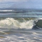
The In-between Areas. We tend to look at objects, and not so much the spaces between them. However there’s a whole lot of information in between the objects as well. We're really doing ourselves a dis-service as an artist if we don’t pay attention to that information as much as the objects themselves. Remember, we can only see a fraction of (our version of) reality at any given time. 
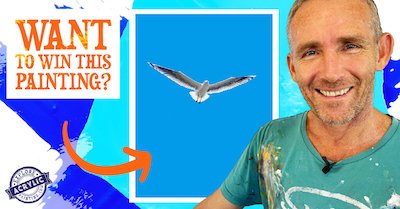
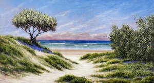
Win a Mark Waller Original Painting valued at $1100! Time to get your paints out people :) Click the image above or the link below for more info. Click here for all the info on how to win this MW original! New YT Short! Following on from last month's "So I Paint" thoughts from the easel, we have some another new short from Mark's vault of thoughts/poems. We hope you like this, the second in this series: "Gone". Please note Mark is very much alive and well! It is a metaphor :) Click here for the Youtube short "Gone" Art For Floods - Update As you know, our North Coast communities were devastated by floods in March. The Art For Floods project which ran last month, along with over 400 artists and buyers, raised over $200,000 in just two days! An awesome result! Mark's painting above went to a wonderful couple based in Sydney. Click the image above for the detailed info on their website.  Every month, we choose an Artist from our
forum
to showcase.
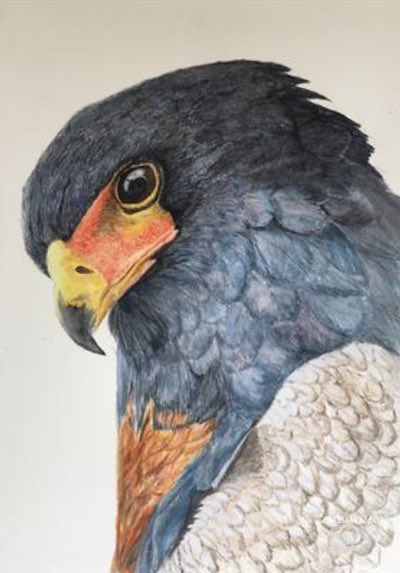
 You can even nominate someone if you like. (Or yourself!). To do this, check out the forum and then send us an email! It’s that easy. This month we're featuring artist Sally, from Melbourne, Victoria with her stunning painting,"Some Sort of Eagle". Thanks so much for sharing this with us Sally, we will forgive your foray into the dark arts (ie watercolour haha) for such a stunning image! Click here for more information on Sally's painting "Some Sort of Eagle" 
Fibre artist Liam Lee will delight you with his organic but psychedelic furniture creations, inspired by enoki mushrooms and flowers, he also aims to make people feel “a little weird” when viewing his work. Check out his instagram here! Do you love crazy realism? Check out the insanely good work of oil painter Fabiano Millani. Astounding realism awaits your eyeballs! If you have a link you like, please share it with us! You can contact us to let us know. Thank you!  This is the section where you can "get your name in lights!" (well at least out there in the internet world!).
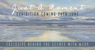
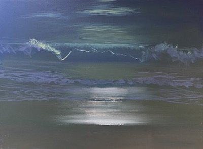
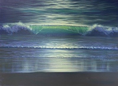
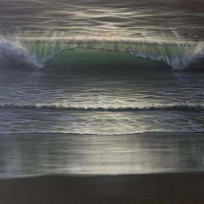
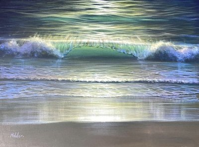
If you have works in progress you would love to show off, or finished pieces you are particularly proud of, we would love to see them! We especially like to hear about the story behind the creation. This month's submission comes, again from our very own Mark Waller with his painting "The Not-Waves". From Mark: "This painting came about because we’d just done a workshop, and happened to come across the idea of painting the wave by painting the bits that aren’t the wave, or, as we said in the workshop, painting the “not-waves”. I used a mixture of Free Flow and Atelier Interactive for this painting, the White Free Flow to draw out longer lines and the surface fo the water, and the AI to tint it, and in areas where I needed to blend. So basically I started off with a background that I thought might represent some of the colour that you might see in the dark, at night. I prepared the canvas with a mix of Dioxazine Purple and Pthalo Blue, with a small strip at the bottom right hand side which had a little Cadmium Yellow Medium and I almost eliminated the Pthalo Blue (too green).
I wanted to lean into the browns more than the greens, this was to represent the wet sand. I then literally went into pure White. By doing this I was establishing the darkest darks and the lightest lights, and because in a picture that’s dark, the light becomes the “structure”. The light is then the part that everything else is built around. Exactly the same as my normal process, but instead of painting the objects in the space, this time I’m painting the light around the object in order to paint the object. I added Cadmium Yellow Medium to the original background colour and started representing the surface of the water away from the light source working back towards it. I added more White, Cadmium Yellow Medium and Permanent Alizarine to that colour, and began to represent the ripples on the surface moving closer to the light source.
Up to now these colours have been quite dark, and put there to make sure I get some detail into the shaded areas. I mixed a paler colour using White, Cadmium Yellow Medium and Permanent Alizarine, and painted this as a transition colour between the white reflections on the surface of the water and the darker areas, to provide a transition in those areas of darkest dark and lightest light. I also used this colour on the tops of the whitewash in the breaking wave to create the impression that the light was hitting the tops of them, and that the front of the wave was in shadow. I wanted the waves to look backlit. I also used this colour on the suds in the foreground, and the reflections on the wet sand. Using the base colour, I then added a pile of White, and some Dioxazine Purple so that I had a kind of a purple-grey colour, and painted the shadows in the whitewash areas. I mixed up a lovely lurid green using Pthalo Blue and Cadmium Yellow Medium and some White, to create the impression of the light shining through the back of the wave.
From that point on, the painting was to-ing and fro-ing between the transitions between the light and the slightly less lit areas; and representing the warm to cool theory (i.e, warmer colours closer to the light source, cooler colours further out from the light source). I did this in the surface of the water, the breaking wave, the smaller whitewash in the foreground and the wet sand as well. I then grabbed a dry brush, pushed a little bit of Permanent Alizarine into the outer extremes of that transition, and then mixed Cadmium Yellow Medium and did the same thing closer to the light source. A few little highlights here and there to suggest the spray on the face of the wave, and to suggest the wave curving over as it broke. Then of course there was the obligatory meandering around the painting for an hour or two, not making much of a difference but just putting some paint here and there. I think we have to go through that before we realise the painting is actually finished. :D This type of painting is something that I tend to do when I’m a bit stuck. It’s light, it’s fun, it reminds me of how much fun painting is, it re-establishes all the theories, and as a bonus, it looks great :) It’s always surprising just how much colour you can work into an area which can easily be seen as being quite dark and uninteresting.
Click here for his Instagram Click here for his Facebook And click here for his Website! We hope you enjoyed this issue of Acrylics Anonymous! If you have any suggestions, comments or feedback for the ezine or our site, please don't hesitate to contact us. Until next time, make sure you stay safe and well, and don't forget to chuck some paint around! Cheers from Frankie & Mark :) For our Youtube channel, click here. To join our Youtube channel as a member for a few bucks every month (in exchange for even MORE awesome perks, click here. For our Instagram, click here. For our Website, click here. For our Facebook page, click here. For our Pinterest, click here. For our Tik Tok, click here. |
| Back to Back Issues Page |
